SnapBox Logo
In 2014, SnapBox underwent a re-branding effort to more firmly establish itself as a premium photo products company. As part of the re-brand, the logo was re-designed.
ClientSnapBoxTypeBranding, DesignToolsFireworks CS6, Illustrator CC, Photoshop CCYear2014
This was the original logo (designed in 2012).
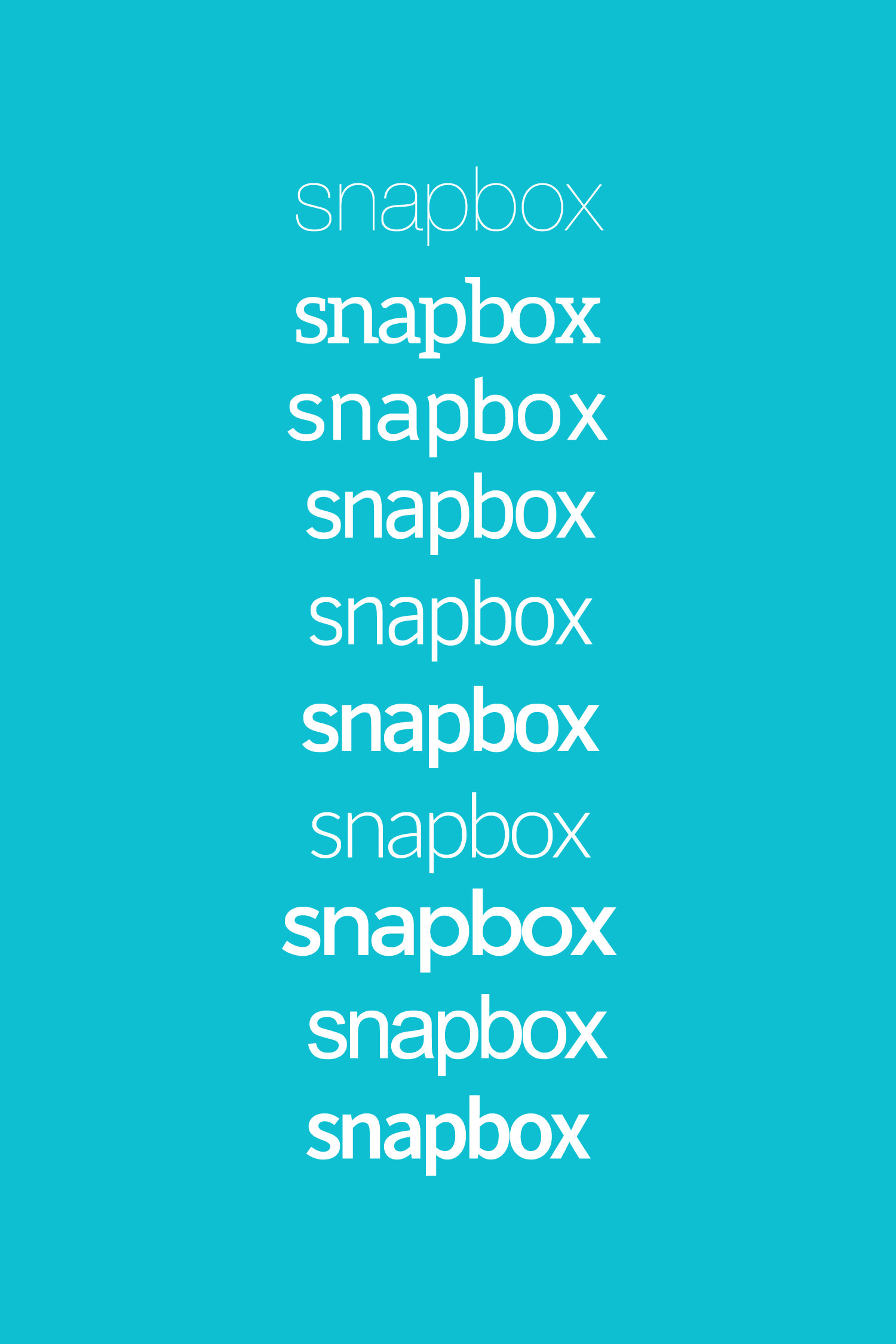
From the outset, I knew a modern typeface would be the direction the logo needed to head in. From a selection of typefaces ranging from thin to heavy weights, Source Sans Pro emerged as the winner. The native typeface was used for the most part except for the letter “a”, which was altered to more closely match the “p” and “b” letters adjacent to it.
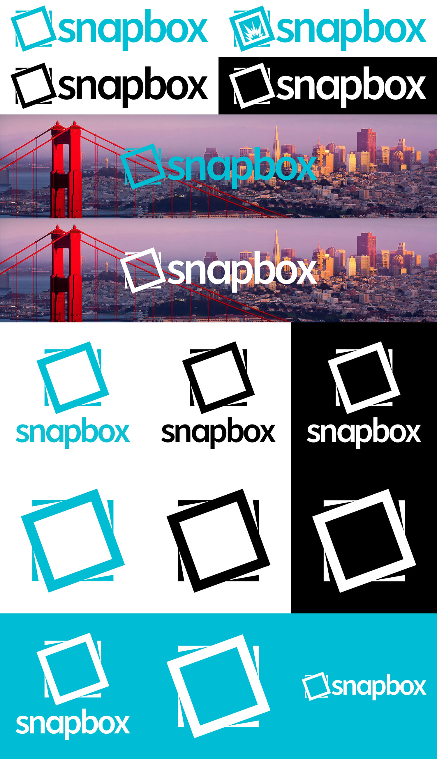
The goal for the icon was to create something simple (rather than overly adorned or detailed) that best represented what SnapBox does. The ultimate design is meant to evoke a stack of 3 photo prints slightly twisted through the two white squares and the negative space in between created by both. The icon could also be interpreted as a canvas frame, which is important because the company’s core product is canvas prints.
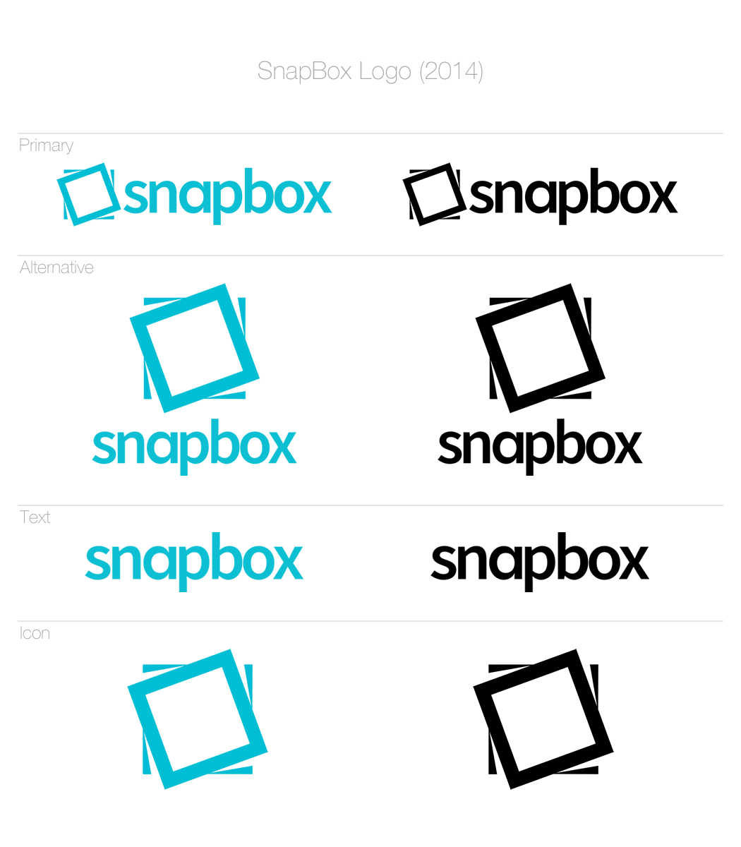
Overall the re-designed SnapBox logo was created to be easily adaptable to varying print and web uses, including in both color and black and white versions.


