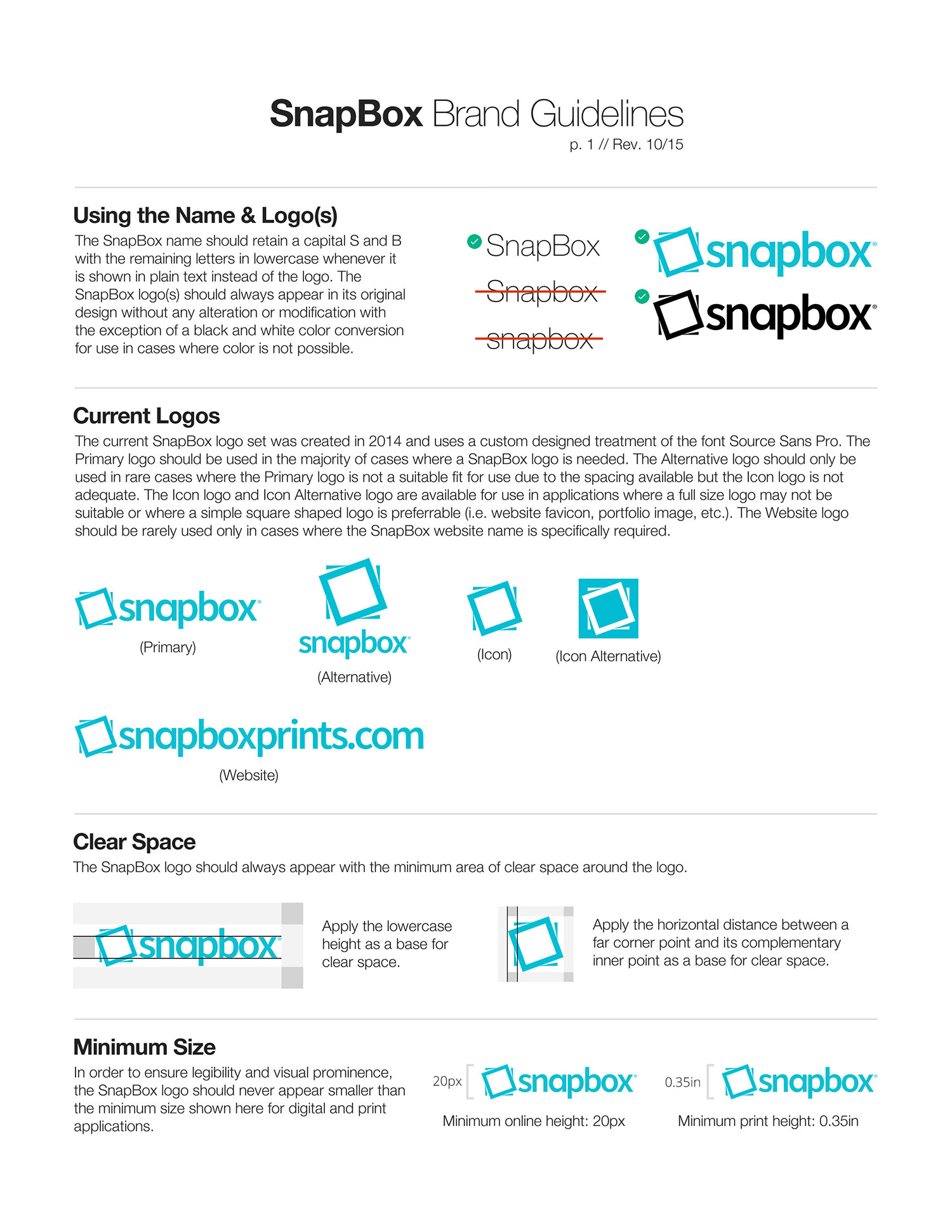
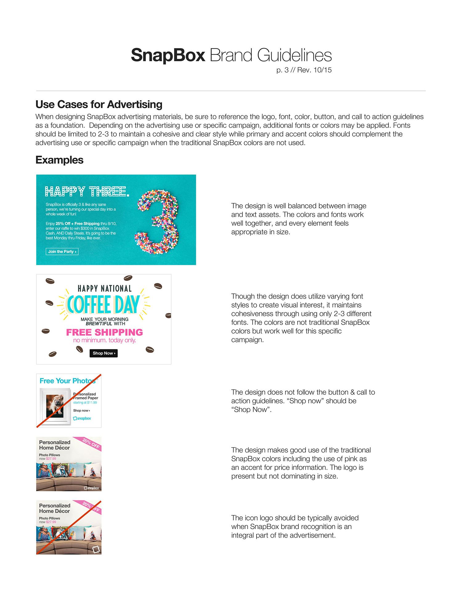
SnapBox Brand Guidelines
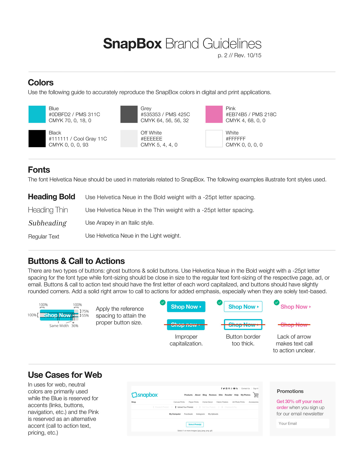
A major part of my role in SnapBox was to establish rules that could be followed when designing for the brand whether it be on the website, emails, or ads. I created a set of brand guidelines in order to maintain a consistent visual identity across the various assets that need to be created for SnapBox on an ongoing basis. Neutral colors balance out the strong SnapBox blue tone while the pink allows for specialized focus such as on pricing. Detailed rules for call to actions ensure consistency such as in cases of capitalization across a string of words (i.e. “Shop Now”).
ClientSnapBoxTypeBrandingToolsPhotoshop CCYear2016